
CAPITAL ONE / PARTNERSHIPS EXPERIENCE DESIGN
Making the next
step clearer.
At Capital One, I worked across two sides of the Partnerships experience: helping customers understand card offers and helping external partners navigate developer resources.

Who needs what?
Customers needed to be informed about card offers and next steps. Potential partners needed a clear way to find documentation and integrate developer tools.
Information architecture for three card solutions and content design for offer and decline experiences.
DevEx and IDSX site mapping, landscape analysis, and navigation concepts.
01 / PROJECT 1
Make the offer clear.
Make the next step visible.
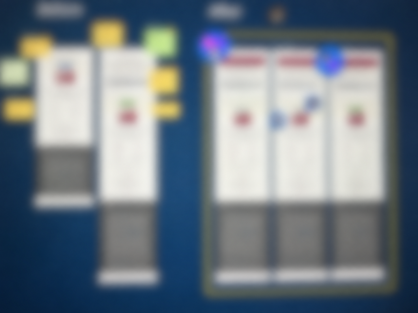
Project 1 focused on the customer experience for an in-store tablet application. I worked on information architecture and content for three card solutions, including offer screens and messages shown when an application needed a different next step.
02 / PROJECT 2
Make integrating systems easy.
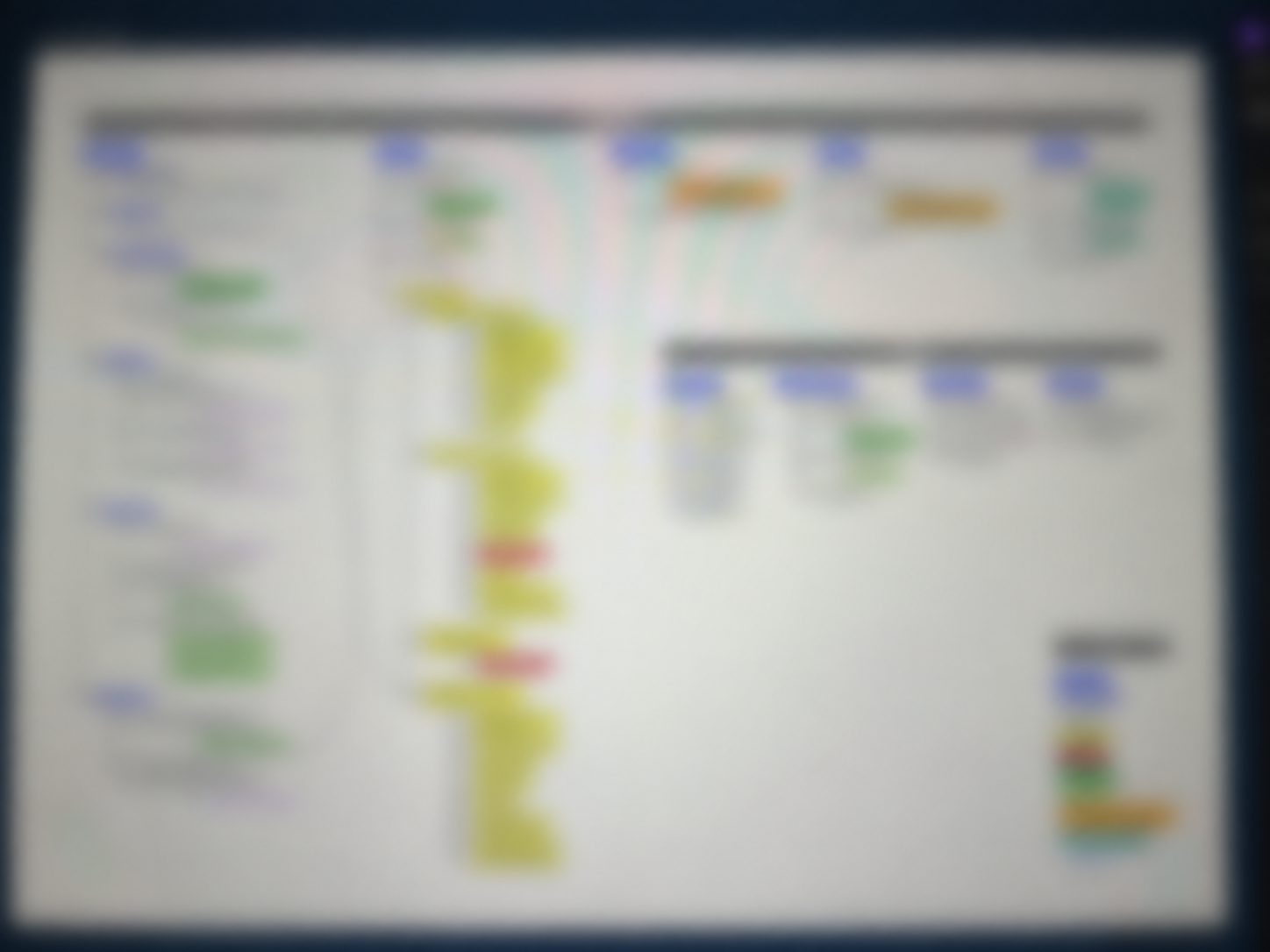
The Project 2 work explored a self-service developer experience for external partners. My contribution included mapping the existing structure across DevEx and IDSX and examining how partners could move between the portal and developer resources.
DELIVERABLES
Structure and content
for two connected experiences.
I set up information architecture for three tier card solutions when signing up for a branded card. Previously, the design system could only manage 2 tiers. I also built out what happens when that offer is accepted or rejected as well as the language used in the notifications.
I built high-level site mapping between DevEx and IDSX, landscape analysis, and user flows for a new multi layered navigation bar that combines both platforms while removing redundancies and existing errors. I took the first stab at this project to reduce timelines by 77%.
REFLECTION
Clarity is key.
Content design and storytelling played a larger role than I initially expected. Across both projects, the way information was organized and explained was central to the experience.