
RADIANT DESIGN SYSTEM / DISCOVER
Building systems
that help teams
move faster.
At Discover, I built tools used by the whole organization and products seen by millions of users.
Radiant Design System
A good design system serves both design and developers. Designers need components that can be quickly used and adapted to new projects while developers need context to build them. I worked on 5 projects that addressed these needs.
I led the first iteration of the Email UI Kit and did a total overhaul of the component guidance workflows.
I proposed a freeze account icon, supported the Manage Wallets mobile app page redesign, and researched developer documentation structure.
01 / EMAIL UI KIT
Bring Email Design In House.
Make it reusable. make it modular.
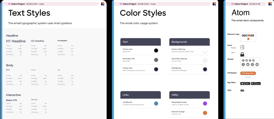
Discover’s email templates had been created externally in Photoshop. This process was expensive, took longer, and was outdated. With the Capital One merger closing in, it became urgent to have an in house workflow to design, build, and distribute emails to cardholders.
The challenge
I was responsible for manually translating Photoshop files into Figma and creating a dedicated email design system that was separate from Radiant. The kit needed customizable modules and variants for mobile and desktop.
The decisions
I defined typography, color styles, and components, then assembled them into reusable modules. I adjusted spacing to follow a consistent scale and updated the orange to match Discover’s current brand color.
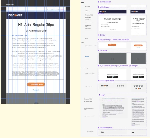
The first iteration of a Figma Email UI Kit: a standardized template for designers to create emails in house, rather than making them from scratch each time.
02 / COMPONENT GUIDANCE
A template that stays useful
when people edit it.
The existing guidance template was difficult to maintain. Designers had to detach instances to use it, auto-layout behaved inconsistently, and edits could break the structure. Branding was also applied unevenly.
Modify the existing system instead of starting over
I built on the existing component guides since the designers already knew how they worked and what needed to be fixed. I simplified the process of building component guides and created overlay components that could be placed using absolute positioning. This let designers continue their work without having to break the component.
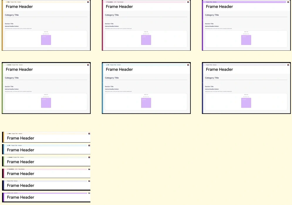
I also changed the documentation structure to horizontal modules as a way to reduce complications when merging branch files. This also made it easier to update and add to component guides when needed.
The design team began converting guidance templates to the new structure I built.
03 / SNOWFLAKE ICON
Why does “freeze” look
the same as “lock”?
I researched and proposed a snowflake icon for freezing an account. The existing lock symbol is used for both freezing and locking despite having different meanings.
Freezing is a security feature done by the user while locking is a security measure done by the institution.
Small icon. Specific meaning.
I conducted competitive analysis, explored variations, and presented recommendations at a design system office hours. I tested ideas built around existing hand and lock icons, but those combinations made the freezing action harder to read at a small size.
The final direction used a standalone snowflake at 24 x 24 and 16 x 16 pixels, aligned with the foundational icon set.
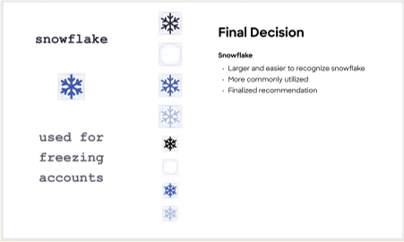
The snowflake was approved and added to the design system.
04 / MANAGE WALLETS
Connect product exploration
back to the system.
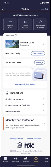
Manage Wallets page brings together card and account actions in Discover’s mobile app. I supported the other interns with a redesign by ensuring feasibility and existing design system compatibility with their explorations.
My contribution
I checked typography, colors, and component usage against the v2 Foundation library, discussed feasibility with developers, and suggested refinements to visual design and iconography.
Before the final deliverable, I reviewed every frame against the Mobile UI Kit. This was a supporting design-system role within a collaborative redesign, rather than sole ownership of the page.
A frame-by-frame consistency review and design recommendations for the team’s wallet flows.
05 / DEVELOPER NOTES
Creating documentation that bridges
design and development.
I researched how other design systems surface component information in Figma, then conducted observational interviews with developers to understand their workflow: what they look at first, what context they need, and how they process it.
Turn observations into a format.
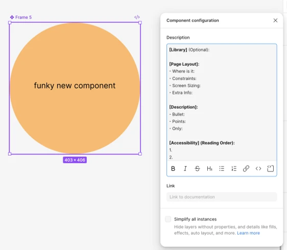
I created a report and a copy-and-paste template for designers. It organized library context, page layout, constraints, screen sizing, descriptions, accessibility reading order, and update history.
The template was designed to make handoff clearer while leaving room for different levels of component complexity.
REFLECTION
A system is only as useful
as its foundation.
This was my first experience working on a complex design system and within a sprint based team. It was rewarding to understand the what why and hows behind a design system.
Over the summer, I saw how my projects shared a common theme: making work easier for others , whether its building emails, creating components, or freezing an account.