reflection
This was a really fun client project, especially with how much creative freedom we were given. We designed for responsive platforms from desktop, tablet, and mobile. This project had a lot of client interaction which was nice since we were able to get feedback from all stages.
I really enjoyed being able to try out as many creative ideas as possible. We were a smaller team but it made communication very smooth and easy. If I were to do it again, I would have liked to implement more user research, but, the change of pace was very rewarding to learn more about branding and visual designs.
back to top

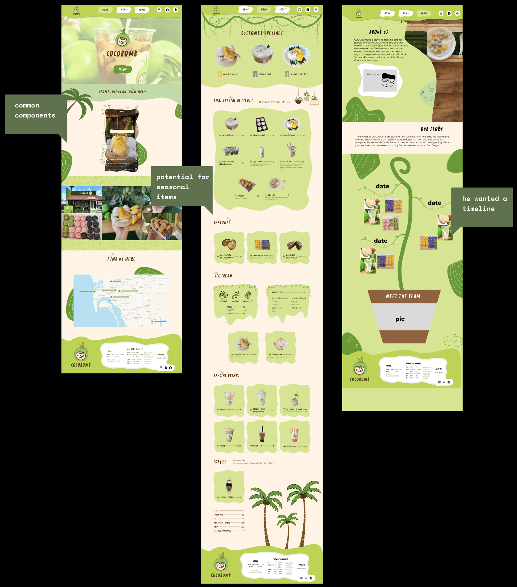
a/b testing
For each client meeting, we presented many versions of our progress so that he could pick and choose what he thought would be best for Cocobomb.
final iteration
So this time around, we received a lot of feedback and changes. So the home and about us page went through the most drastic changes from the start. After many client and team meetings, we were all satisfied with the results and now it has been handed off to the development team.
Cocobomb
Role
UI/UX Designer
Timeline
June 2023 - December 2023
Process
Research, visual design, branding, competitive analysis, iterations, midfi, hifi, responsive
Overview
Research
Visuals
Design
Design
That's All Folks
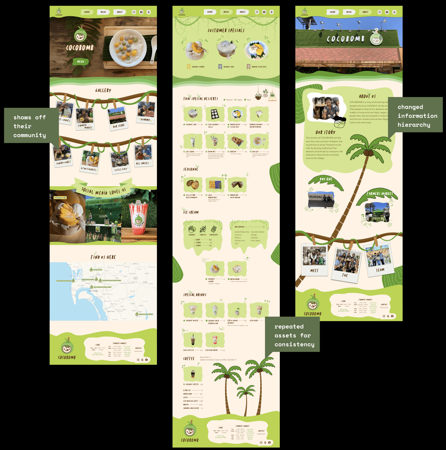
PARC
This was a more UI focused project but we still made sure that the PARC principles were still being followed. So common assets were used on every page for repitition. A design system to maintain a consistent proximity and alignment of text and color contrast for font legibility.
Proximity
Alignment
Repetition
Contrast


competitive
analysis
Cocobomb already has a strong branding so instead of looking at general dessert shops, we targeted those with more “fun” websites that had a creative vision.


Desktop
Font
Type
Size
Weight
Sunday Morning
Sunday Morning
Montserrat
Sunday Morning
Montserrat
Montserrat
Montserrat
H1
H2
H3
Body
Body 2
Body 3
Body 4
60pt
48pt
32pt
24pt
20pt
14pt
12pt
N/A
N/A
Regular
Regular
Regular
Regular
Regular
Tablet
Font
Type
Size
Weight
H1
H2
H3
H4
Body 1 Text
48pt
32pt
24pt
20pt
14pt
N/A
N/A
Regular
N/A
Regular
Sunday Morning
Sunday Morning
Montserrat
Sunday Morning
Montserrat
Mobile
Type
Size
Weight
Font
H1
H2
H3
H4
Body 1 Text
28pt
24pt
20pt
14pt
12pt
N/A
N/A
Regular
N/A
Regular
Sunday Morning
Sunday Morning
Montserrat
Sunday Morning
Montserrat
Primary Color
Secondary
1024 px
32 margins
390 px
24 margins
1280 px
48 margins
moodboard
There was already a great source of inspiration from the shop and food itself. Green was reoccurring so we made sure to include it with flashes of yellow from mango. We wanted to keep it tropical with palm trees and green life. We modeled parts of the website from the menu and kept their iconic font to keep it consistent.

style guide
We had 3 pages so it was important to keep them similar since any differences would be easily spotted. Since the designs were more creative and chaotic, it needed a design system to keep it all in order. So margins, font type and size, color palette, and components were all organized to maintain consistency for responsive designs.
description
Cocobomb is a Thai dessert shop located in San Diego, they are also in multiple farmer’s markets each week. They sell milk tea, ice cream, and traditional Thai treats with a strong emphasis on coconuts. They want a website with a Home, About, and Menu page. Maintaining a fun atmosphere is a priority for them.
problem
They are active in their community through their shop and farmer’s market stands. In addition, they have been showcased on TV and gone viral a few times on their social media such as Instagram and Tiktok. This has driven customers to want to learn more about them and seek a website that currently does not exist. This makes potential customers lose interest in their business.
Viral posts + TV coverage


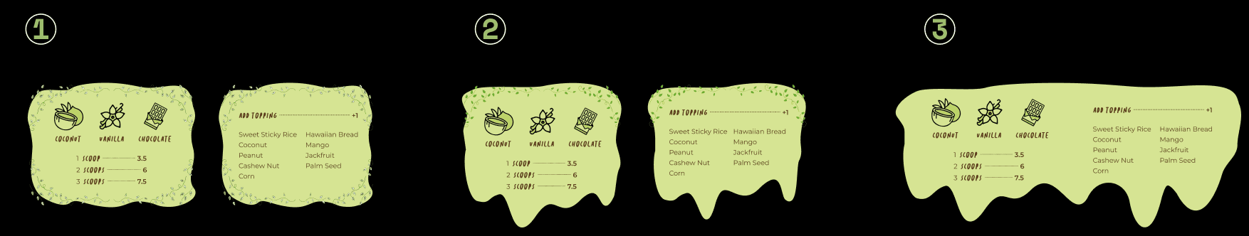
1st iteration
We took inspiration from their menu style and store interior to create the first iteration. We used very flowy shapes and subtle art to make it feel relaxing and fun. We got feedback from the client such as; add more vector art, gluten free symbols, top 3 desserts, and a large mast head.
2nd iteration
We took the feedback and spent more time on adding the adjustments that the client wanted and also overall refinding the site as we were given more images to be used. He was not a fan of the about page so I started over from scratch and made a mock up that would be improved upon later. For the home and about, we spent more time adding the new features and small details to add life to the design.